
By Samuel
01.08.2024
Why CSS Container Queries?
Note: In Chrome, CSS Container Queries are supported since version 105 (August 2022).
Example
Let's say we want to build a component that links to "Sam's Burger Shop". It will be shown in two different places on our website. In cases where the available space of its parent component is small, its text and image should responsively rearrange to still look nice:
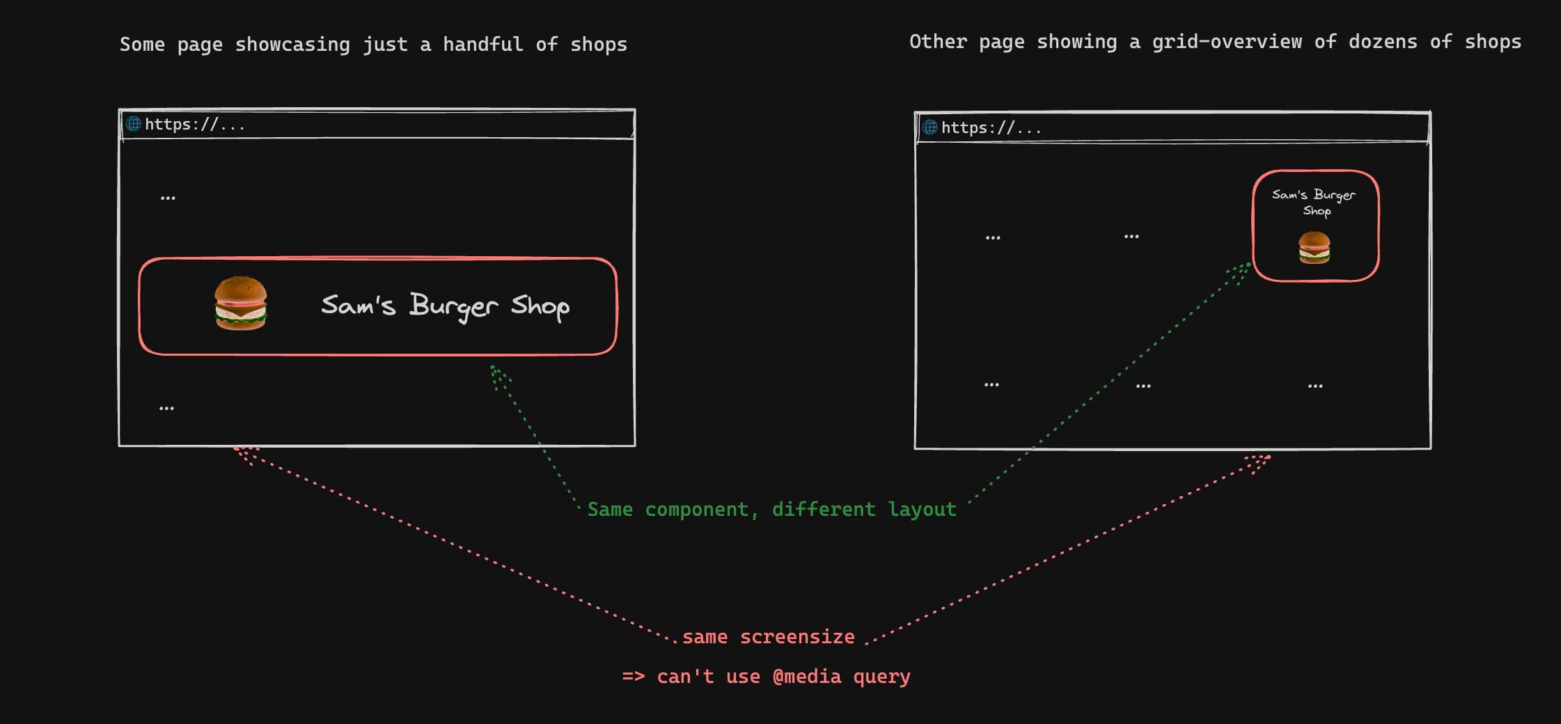
Question: How can we style the component differently depending on its width? (without using Javascript)
Answer: CSS Container Queries
The component in our example is a clickable box that contains an image and text, which should change it's appearance depending on the available width of its container:
...image and text...
Using a Container Query, we can adjust the layout of the card content based on the available container width:
.samsBurgerShopCard {
  /* By setting the container type, child elements using @container will be based on the size of the samsBurgerShopCard div */
  container-type: inline-size;
  /* Optional: container-name: sams-burger-shop-card-container; */
}

.samsBurgerShopCardContent {
  /* ... styles that place the burger image above the text ... */

  /* Apply following styles depending of the width of the samsBurgerShopCard div */
  @container (min-width: 600px) {
    /* ... styles that place the burger image to the left of the text ... */
  }
}
Do I still need Media Queries?
CSS Media Queries will still be relevant to retrieve user preferences, for example the preferred color scheme:
.landingPage {
  background: white;

  @media (prefers-color-scheme: dark) {
    background: black;
  }

  @media (update: slow) {
    /* disable animations on devices that are very slow at rendering content (e.g. e-book readers) */
  }
}
CSS
Weitere Beiträge

Viele Produktideen scheitern, weil sie an den tatsächlichen Bedürfnissen der Nutzer:innen vorbeigeplant werden. Product Discovery ermöglicht es Teams, den Problemraum genau zu verstehen, Ideen systematisch zu generieren und früh zu validieren. Durch cross-funktionale Teams, iterative Tests und enge Verzahnung von Discovery und Delivery können Produkte entwickelt werden, die sowohl Kund:innen begeistern als auch strategisch zum Unternehmenserfolg beitragen. So wird Nutzerzentrierung nicht nur Ziel, sondern gelebte Praxis.
If you use Git via the terminal, here's a quick tip that might make your workflow easier.
I'm now two years into my note-taking experiment: having a single digital place where I can comfortably think about, formulate and interconnect anything I learn.